Behind the facade of our new UI
We’ve been talking about it for a long time. Our new user interface (UI) finally went live last night! For those of you who managed to avoid all the chatter, this is the biggest cosmetic update to Liquid State since Liquid State began.
As we added more and more features to Liquid State, we started to realise the old interface just wasn’t coping well. We needed to make it easier to see key information about apps, issues, and pages, as well as making the path to publishing as clear as possible. So, after some intense planning sessions and a whole lot of long nights, we released the new look for the Liquid State UI.
UI Comparison
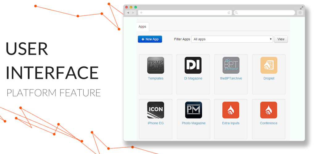
 This is only the list of apps, but even here, the new Liquid State UI is a big improvement.
It’s the same great technology underneath the new coat of paint, with all the same features and the ability to publish to the three major mobile platforms: iOS, Android, and Windows Phone. Long-time users might notice a few extra features we slipped in to this release, too (import from PDF, Word and other document types), but I’ll save talking about those for another time.
If you’re curious to see what all the fuss is about, then login or sign up today.
In the meantime, if you’re an existing user who’d like to know just where everything went, have a look at the video below.