In the last year alone, the flurry of technological advancement in mobile devices has been truly astounding. Aside from the functionality that these devices now offer to users, these developments have also caused a paradigm shift in the publishing industry.
Small businesses, startups, and even individuals, are now able to self-publish digital publications – with a little help from those in the know.
Liquid State offers users the ability to self-publish mobile and tablet applications in a variety of ways. Stand alone apps and library apps, chalked up from scratch or re-appropriated from existing designs, aimed at iOS, Android, or Windows Phone – the Liquid State Publishing System offers options to suit a huge range of user needs.
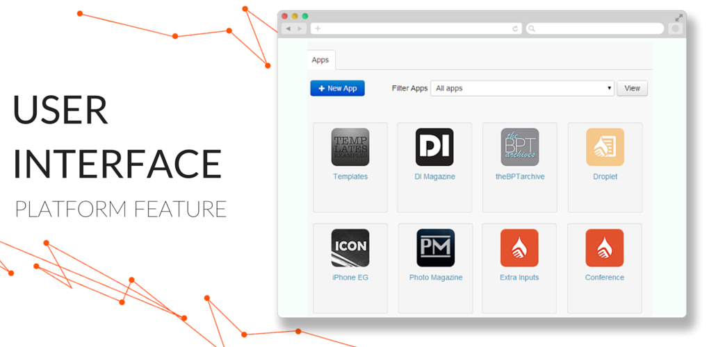
Of course, with the ever-evolving nature of mobile technology, it is essential that publishing services keep up to date with the latest developments, and update their products accordingly. This has been, largely, the purpose behind Liquid State’s newest User Interface (UI) overhaul. The implementation of the new UI is the single largest change to the Liquid State system since its inception several years ago.
The new UI incorporates so many cosmetic and practical changes that it’s genuinely difficult to list them succinctly. Instead, a few of the cleverest and most useful ingenuities of the new UI are listed below.
Progress Bars
There’s no doubt that designing, building, and publishing apps from scratch can be challenging. Prior to the UI update, even Liquid State’s streamlined system could get a bit confusing. Now, the Liquid State Publishing System incorporates a simple feature that makes a huge difference to publishers: progress bars. Having a visual representation of your configuration progress is so simple and effective; it is hard to imagine what we did before.
In particular, the addition of progress bars has made it incredibly easy to tell exactly which configuration steps have or haven’t been completed for each individual platform. The main app configuration page in Liquid State Cloud now displays three progress bars: one for iOS, one for Android, and one for Windows phone. These work independently of one-another, and provide publishers with a colour coded indication of how close they are to publishing their app.
Red bar? You’ve got a fair way to go. In fact, your app can’t be published yet because it is missing essential details.
Yellow bar? You’re almost there, but you’ve still got a bit of work to do. Your app can be published – but we wouldn’t recommend going ahead quite yet.
Green bar? Good one! Your app is fully configured. You can now publish your app, and send it off to the app stores.
Aside from the colour coding system, the new UI also provides information about exactly what needs to be configured. Clicking a platform’s icon redirects through to a page that lists all of the configuration options for that particular platform. A tick, cross, exclamation point, or information symbol will display next to each step, indicating if the step is complete, incomplete, semi-complete, or if there is further relevant information.
Together, these progress indicators are pretty much foolproof. You’ll will never find yourself having to manically search for an incomplete configuration step again – as long as you keep an eye on the your progress bars.
New Import Types
The new UI also includes a remarkable increase in functionality – the addition of several new import types. Amongst these new import types are three of the most commonly used file types of all: PDF documents, Microsoft Word documents, and Microsoft PowerPoint documents. Publishers who aren’t familiar with more advanced digital publishing techniques, such as using InDesign or HTML, can now create basic file types as they normally would – and turn them in to pages of an app within a few clicks.
The Liquid State Publishing System now accepts even more file types
The introduction of these new import types means that it is truly possible for anyone to get publishing… Technophobes: we’re looking at you!
Drag-and-Drop Functionality
One of the simplest, most intuitive features of the new UI is the ability to drag-and-drop within Liquid State Cloud. In the past, re-ordering apps, issues, and pages required publishers to use up and down buttons to re-order pages one increment at a time. Now, you are able to move an app, issue, or page entry to any position within the Liquid State Cloud within a matter of seconds.
Again, this is a change that typifies many of the features of the new UI. A simple, elegant feature that may seem humble, but stands to make the digital publishing process easier than ever.

